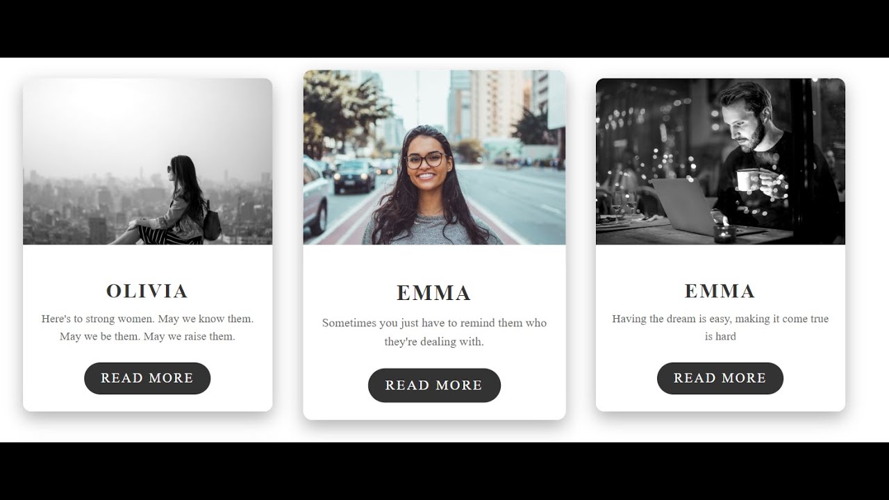
CSS CARD HOVER EFFECTS
 |
| CSS card hover effects |
In this tutorial, we will teach you how to create stunning animated card hover effects using HTML and CSS. By the end of this video, you will have a thorough understanding of how to create unique and eye-catching animations that will make your website stand out.
We will start with a brief introduction to HTML and CSS and the basic principles of animation. Then we will dive into creating the card hover effects step by step, explaining each line of code as we go. You will learn how to use CSS transitions and transforms to create smooth and engaging animations, and we will show you some advanced techniques to make your effects even more impressive.
Some of the key highlights of this tutorial include:
- How to create a hover effect that makes a card flip and reveal additional information
- How to make cards slide or expand on hover
- How to create a parallax effect that moves the background image with the mouse
- How to use perspective and 3D transforms to create a 3D card effect
We will also provide some tips and best practices for optimizing your code and ensuring your animations run smoothly across different devices and browsers.
Css Card Hover Effects Source Download :
CSS :
.card {
display: inline-block;
margin: 20px;
position: relative;
box-shadow: 0 8px 20px rgba(0, 0, 0, 0.3);
border-radius: 10px;
overflow: hidden;
width: 300px;
height: 400px;
background-color: #fff;
transform: scale(1);
transition: transform 0.2s ease-in-out;
}
.card:hover {
transform: scale(1.05);
}
.card-image {
height: 200px;
overflow: hidden;
position: relative;
}
.card-image img {
width: 100%;
display: block;
height: auto;
position: absolute;
top: 0;
left: 0;
right: 0;
bottom: 0;
margin: auto;
filter: grayscale(100%) contrast(1.2);
transition: filter 0.2s ease-in-out;
}
.card:hover .card-image img {
filter: none;
}
.card-content {
position: absolute;
bottom: 0;
left: 0;
right: 0;
padding: 20px;
background-color: #fff;
text-align: center;
}
.card-content h2 {
margin: 0;
font-size: 24px;
color: #333;
text-transform: uppercase;
letter-spacing: 2px;
}
.card-content p {
margin: 10px 0 0;
font-size: 14px;
line-height: 1.5;
color: #666;
}
.card-content a {
display: inline-block;
margin-top: 20px;
padding: 10px 20px;
background-color: #333;
color: #fff;
text-decoration: none;
border-radius: 25px;
text-transform: uppercase;
letter-spacing: 2px;
transition: background-color 0.2s ease-in-out;
}
.card-content a:hover {
background-color: #555;
}
HTML :
<div class="card">
<div class="card-image">
<img src="https://images.pexels.com/photos/1755385/pexels-photo-1755385.
jpeg" alt="Your Image">
</div>
<div class="card-content">
<h2>Olivia</h2>
<p>Here's to strong women. May we know them. May we be them. May we
raise them.</p>
<a href="#">Read More</a>
</div>
</div>
<div class="card">
<div class="card-image">
<img src="https://images.pexels.com/photos/1239291/pexels-photo-1239291
.jpeg" alt="Your Image">
</div>
<div class="card-content">
<h2>Emma</h2>
<p>Sometimes you just have to remind them who they're dealing with.</p>
<a href="#">Read More</a>
</div>
</div>
<div class="card">
<div class="card-image">
<img src="https://images.pexels.com/photos/842548/pexels-photo-842548
.jpeg" alt="Your Image">
</div>
<div class="card-content">
<h2>Emma</h2>
<p>Having the dream is easy, making it come true is hard</p>
<a href="#">Read More</a>
</div>
</div>
<div class="card">
<div class="card-image">
<img src="https://images.pexels.com/photos/904276/pexels-photo-904276.
jpeg" alt="Your Image">
</div>
<div class="card-content">
<h2>Emma</h2>
<p>I’m not gonna sugar coat the truth, I’m not Willy Wonka</p>
<a href="#">Read More</a>
</div>
</div>
Link After Subscribe:
Click On The Button And Subscribe My Youtube Channel To Open Link Then Get Back To The Page...
